
I like to design dashboards that guide users through the analytics process. Such dashboards allow users to gain their own insights and analyze data in their own way. Tableau has a great feature to build such dashboards: Dashboard Actions. There are three types of Actions: Filter, Highlight and URL Actions. Filter Actions allow you to create pop-up effects by dynamically showing and hiding worksheets on dashboards. There is, however, one issue when dynamically showing and hiding worksheets. If you want the sheets to disappear completely, you have to hide the title of the pop-up sheet/chart. But what if you want the title to dynamically pop up with the chart? In this post I will show you how you add such dynamic titles to your dashboard.
Since there are many great blog posts on how to show/hide worksheets on dashboards, I am not going to describe in detail how to do that. Instead I am going to provide a non-exhaustive list of blog posts for you and focus on the dynamic titles:
- SHEET SELECTION ON STEROIDS by Joshua Milligan
- Facebook Jeopardy: Maintain Context by Creating Pop-up Charts in Tableau by Andy Kriebel
- Dynamically show/hide worksheets on dashboards in Tableau by The Information Lab
Let’s build the dashboard
The data I used for this example is the Super Store Dataset included in Tableau Desktop. The dashboard I built, allows users to analyze sales performance by state, city and product sub-category.
Let’s start by creating the pop-up effect. First of all, we need to create three worksheets. Two of them will be hidden, while one will be visible. The visible one is used to drill-down and make the hidden worksheets pop up. The visible sheet is:
- Sales by State
The hidden sheets are:
- Sales by City
- Sales by Sub-Category
If we add these three worksheets to a dashboard, we get this:
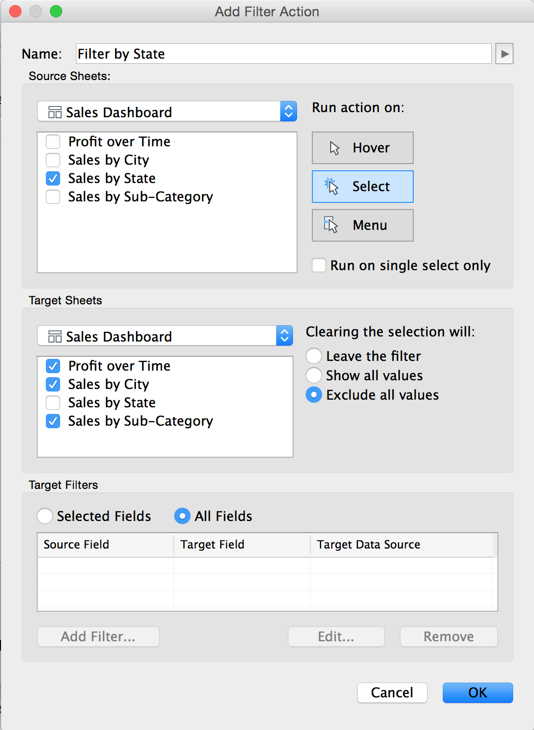
Next, we need to create the show/hide effect. Open the Filter Action dialogue panel to create that effect. You can find it via Dashboard/Actions/Add Action/Filter. As “Source Sheet”, select the worksheet you want to stay visible (e.g. Sales by State). As “Target Sheet” choose the worksheet you want to dynamically pop up. and select “Run action on: Select” and “Clearing the selection will: Exclude all values”. The combination of the two options hides the target sheet when no value is selected on the source sheet.
After creating the filter the dashboard looks like this:
As you can see, the titles are still visible. They take up a lot of space and the dashboard looks a bit messy. If you right-click on the hidden worksheets, you can uncheck “Title” to make it disappear. The dashboard looks much cleaner and the space is used better. However, if you select a “State” on the map, the charts that pop up have no title displayed.
Let’s make the titles appear dynamically
If we want to have dynamic titles, we need to do the following:
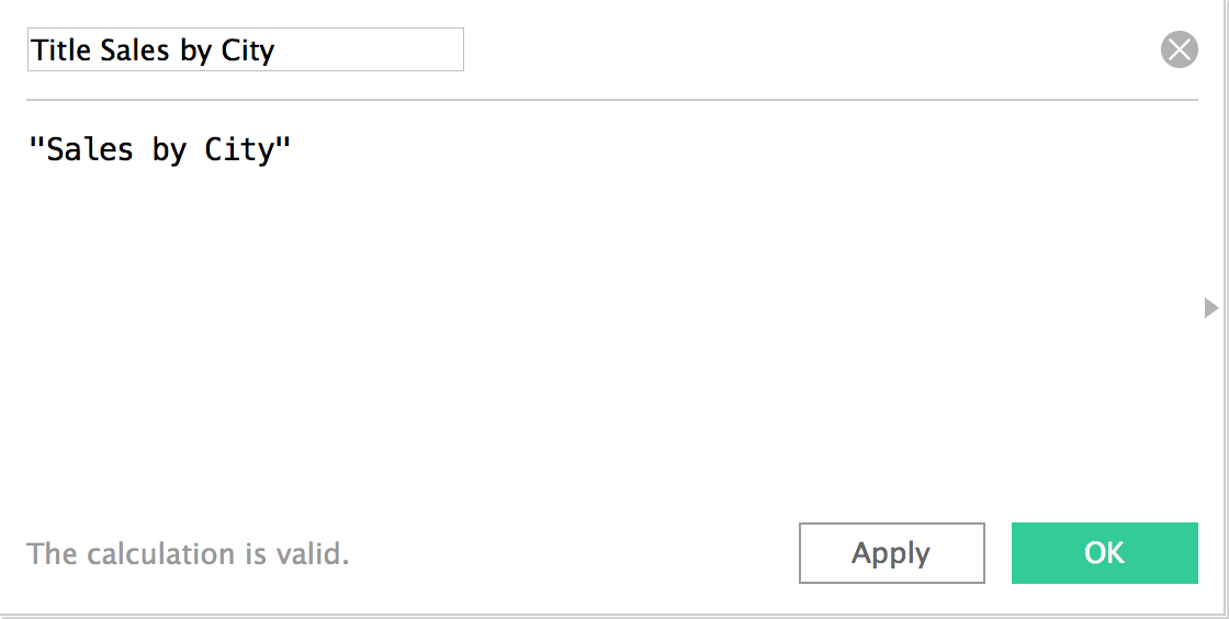
Firstly, go to the hidden worksheet, create a new calculated field and give it a name. For instance, “Title Sales by City”. In the formula box, type in the title you want your users to see. For example, “Sales by City”.
Let’s take this a step further and add a dimension to the title. You can do that by simply adding the “State” dimension to the calculation. For instance, “Sales by City in “+[State].
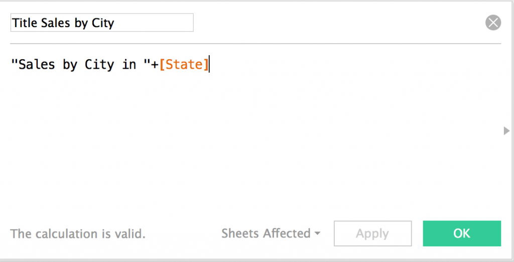
Now, if a users selects New York, the title will be “Sales by City in New York”. You have to do this for all the hidden worksheets.
Secondly, drag the calculated fields onto the column shelf.
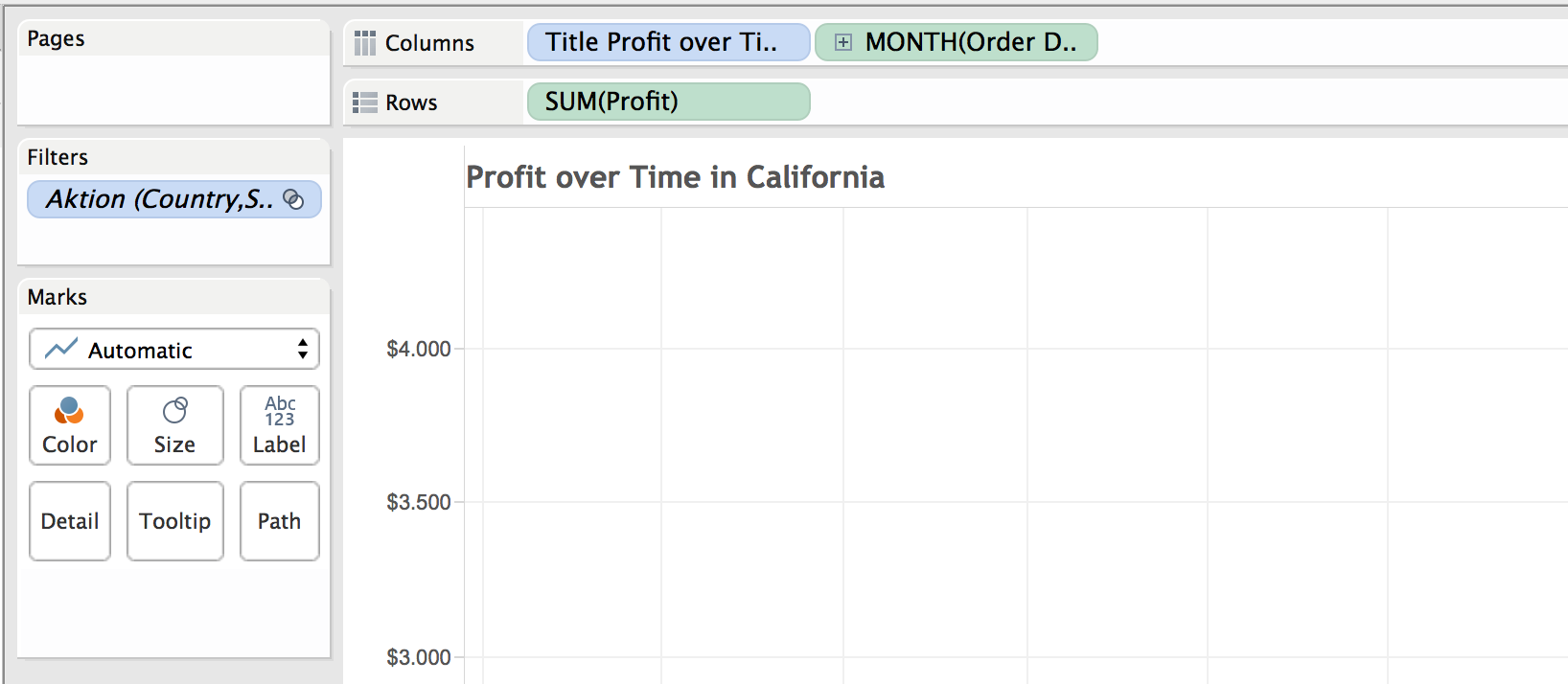
Now that we have done this, if a user clicks on a “State”, he will see the title of the pop-up charts.
The final thing you have to do is hide the field labels for columns. You can do that by going to Analysis/Table Layout. There you can uncheck “Field Labels for Columns” and you’re done. The final dashboard looks like this: